Friday, January 25, 2013

This is my latest piece, it is a self portrait that was inspired by Andy Warhol. I used filters to drastically change this image from a normal picture of me, to this. The original colors where orange and blue but i changed it to purple and orange because they fit better and the contrasted each other. I think that this image is really cool and it is probably my fourth favorite piece that I have done. I wish that it didn't have so many visible pixels.

Thursday, January 17, 2013

This is my latest portfolio piece and I took this picture. I added a lens flair and I painted the stars and solar clouds. I also played with the vibrance, which is better than hue and saturation because it makes the colors more vibrant with out making them have a lot of visible pixels.  

Friday, January 11, 2013

This is my unfinished art piece, it is the meaning of my name, my name means: a creator, a warrior and a poet or an axe. The warrior part is the light armor and the sword (I drew it with the brush tool), the creator part is the armor because it is being created as it moves across my body. I don't know what to do about the poet/ axe part, any suggestions?

Friday, November 30, 2012

This is my latest surreal piece and I had to follow a tutorial but make it my own. In this work I added the clouds, the city, the planet and the sailboat. I also made it black and white and then I made blue but i didn't like the blue so I made it gold. There is a shadow on the mist and I liked it because it was a shadow of the planet and it looked cool.

Friday, November 16, 2012

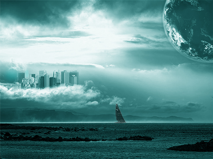
This piece is another surreal piece where my instructor told me to follow a tutorial, but make the piece my own and so I added the city, the planet and the sailboat. It was originally black and white and then I changed it to being red but I didn't like it so I changed the colors and I got this blue that I really liked. after that I made it brighter which made the city and the planet stand out more.

Thursday, November 8, 2012


I first started with rings that were all blue and then I changed them to orange red and purple. After that I used the smudge tool to alter the rings, I didn't like the effect on the colors so I changed them to white and then added an outer glow that was red but the red was too bright so I reverted back to my original blue and it made this.

Thursday, November 1, 2012

For my latest piece I am going to try and replicate this and make it with more vibrant colors and patterns. For this piece I am going to use the pen tool and the smudge tool, I am also going to add more variety with the color scheme and the symmetry.