Friday, November 30, 2012
This is my latest surreal piece and I had to follow a tutorial but make it my own. In this work I added the clouds, the city, the planet and the sailboat. I also made it black and white and then I made blue but i didn't like the blue so I made it gold. There is a shadow on the mist and I liked it because it was a shadow of the planet and it looked cool.
Friday, November 16, 2012
This piece is another surreal piece where my instructor told me to follow a tutorial, but make the piece my own and so I added the city, the planet and the sailboat. It was originally black and white and then I changed it to being red but I didn't like it so I changed the colors and I got this blue that I really liked. after that I made it brighter which made the city and the planet stand out more.
Thursday, November 8, 2012
I first started with rings that were all blue and then I changed them to orange red and purple. After that I used the smudge tool to alter the rings, I didn't like the effect on the colors so I changed them to white and then added an outer glow that was red but the red was too bright so I reverted back to my original blue and it made this.
Thursday, November 1, 2012
For my latest piece I am going to try and replicate this and make it with more vibrant colors and patterns. For this piece I am going to use the pen tool and the smudge tool, I am also going to add more variety with the color scheme and the symmetry.
Thursday, October 25, 2012
This is my latest piece it started out as me just doing a tutorial on surrealism and I decided that I would give my own twist to the tutorial. The original tutorial was a picture of a hand pointing with a snake attached to the finger and the snake was looking at a hawk, there was also rain and lightning in the background. I did not like the hand being there so I took it out and the lightning didn't fit so I did not use it. I made this piece with the eraser tool, filters and hue/saturation.
Wednesday, October 10, 2012
This is my propaganda piece and defend your color can be interpreted in anyway that you want. the colors can represent you or they can represent ideas or what ever you think of. I made this piece with the brush tool and the pen tool. I played with the colors and one was blue and the other was red but I changed it to being orange because it fit better.
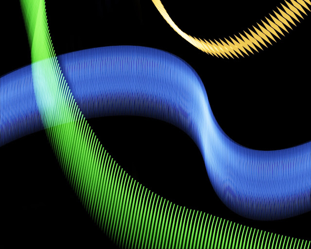
This is my 2nd portfolio piece and my over all theme is lights just like the last two pieces.
This is my 2nd portfolio piece and my over all theme is lights just like the last two pieces.
Friday, October 5, 2012
W had to take a foreign artist and make a piece that is similar to theirs and I chose Yusaku Kamekura a Japanese artist and I made this piece with the pen tool and some effects that made it look futuristic. the piece was black and white before I made the outlines with the stroke effect.
http://gurafiku.tumblr.com/tagged/yusaku_kamekura
http://gurafiku.tumblr.com/tagged/yusaku_kamekura
Subscribe to:
Posts (Atom)


