Friday, November 30, 2012

This is my latest surreal piece and I had to follow a tutorial but make it my own. In this work I added the clouds, the city, the planet and the sailboat. I also made it black and white and then I made blue but i didn't like the blue so I made it gold. There is a shadow on the mist and I liked it because it was a shadow of the planet and it looked cool.

Friday, November 16, 2012

This piece is another surreal piece where my instructor told me to follow a tutorial, but make the piece my own and so I added the city, the planet and the sailboat. It was originally black and white and then I changed it to being red but I didn't like it so I changed the colors and I got this blue that I really liked. after that I made it brighter which made the city and the planet stand out more.

Thursday, November 8, 2012


I first started with rings that were all blue and then I changed them to orange red and purple. After that I used the smudge tool to alter the rings, I didn't like the effect on the colors so I changed them to white and then added an outer glow that was red but the red was too bright so I reverted back to my original blue and it made this.

Thursday, November 1, 2012

For my latest piece I am going to try and replicate this and make it with more vibrant colors and patterns. For this piece I am going to use the pen tool and the smudge tool, I am also going to add more variety with the color scheme and the symmetry.

Thursday, October 25, 2012

This is my latest piece it started out as me just doing a tutorial on surrealism and I decided that I would give my own twist to the tutorial. The original tutorial was a picture of a hand pointing with a snake attached to the finger and the snake was looking at a hawk, there was also rain and lightning in the background. I did not like the hand being there so I took it out and the lightning didn't fit so I did not use it. I made this piece with the eraser tool, filters and hue/saturation.

Wednesday, October 10, 2012

 This is my propaganda piece and defend your color can be interpreted in anyway that you want. the colors can represent you or they can represent ideas or what ever you think of. I made this piece with the brush tool and the pen tool. I played with the colors and one was blue and the other was red but I changed it to being orange because it fit better.


This is my 2nd portfolio piece and my over all theme is lights just like the last two pieces.

Friday, October 5, 2012

W had to take a foreign artist and make a piece that is similar to theirs and I chose Yusaku Kamekura a Japanese artist and I made this piece with the pen tool and some effects that made it look futuristic. the piece was black and white before I made the outlines with the stroke effect.
http://gurafiku.tumblr.com/tagged/yusaku_kamekura

Friday, September 28, 2012


These two pieces are me playing around with the pen tool, trying to figure out what to do for my next project. The next project is where we have to make a propaganda poster about an idea. I have three ideas right now and I am trying to figure out which one to do. I was playing around with the pen tool and I drew a simple line and it looked really cool then i added onto it and i thought that the other lines where cool too.

Thursday, September 20, 2012

This is my newest piece, we had to find an international artist and make an image based on the artists work. I chose Pete Harrison who is a British graphic designer and he incorporates light into his art work. This piece was made with the pen tool and it took me a long time to get everything to work together and get the glows right. I think that this is my best image so far.

Thursday, May 17, 2012

I found this flower in red an changed the colors with the color replacement tool. I was going to make the whole flower multicolored but I stopped at blue and colored the outer part blue and then I added the effect to it and it came out looking like this.

Friday, May 11, 2012

This was a tutorial that I tried to follow a long time ago, I stopped at the making of the colors. This tutorial showed me how to make my own brush and how to apply it. It also taught me how to make pieces of glass look more real. I really liked this tutorial ad I wish that I had finished it.

Thursday, May 3, 2012

We had a project where we had to take a magazine like sports illustrated and make the opposite so i made laziness illustrated. Where you can be a soldier or a football player who is working really hard at what they are doing, while you are siting on the couch doing nothing. I know I spelled laziness wrong but that is the irony of being too lazy to look it up.

Friday, April 27, 2012

This is an image where we had to use actions. Actions is where in photoshop you record what you do and you can play it back and it will duplicate the effect. I made three different colors and added the same effect and then i made a black and white section and put a filter.

Friday, April 6, 2012

movie poster

We had a project where we had to combine two movies so i combined Quantum of solace and the transporter. i switched the heads and made new text and then i made it silver and bumped the concentration up to make the grey parts black.

Friday, March 30, 2012

dodge charger

This image used to be a red charger with a grey background and so I added the gold and the blue.

Friday, March 23, 2012

I found this really cool picture and I thought I should share it.

Wednesday, February 29, 2012

Animals

This project, we had to take two animals and combine them so I picked a hawk and a wolf. I cut the wings off the hawk and put them on the wolf and then played with a filter and it came out like this.

Friday, February 24, 2012

I found a Flower that was red and I changed it to blue and flipped it and it came out as this.

Thursday, February 16, 2012


These are different ways of doing the same image I played with filters and photo filters and it came out like these.

Friday, February 10, 2012

democratic republic of the Congo Project

we had a project where we had to make an image about what is going on in the congo. i selected war, an idea poped into my head where war means the same thing where ever you go. Then i created this image to simbolize that a warzone to us is the same to them.

Friday, February 3, 2012
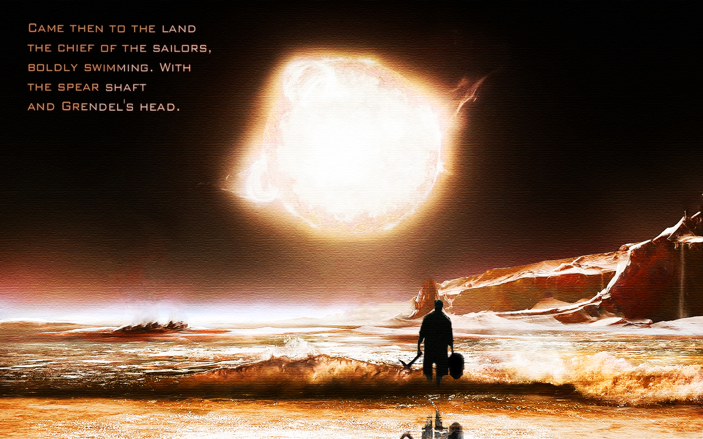
Beowulf Project

This was an english project where we needed to take some lines from beowulf and make a peice that went along with those lines. I have had the background for a long time and I added a man, the sword and the skull. The lines I used are in the top left corner of the peice.

Tuesday, January 24, 2012

cool letters

I made this by following a tutorial, which took a long time and one hundred and forty two layers of each letter. The hardest part of this image would be making the letters show the background and have the letters only show the outlines.the grid was pretty easy and the light at the bottom is a brush.

Monday, January 23, 2012

A Name

This is the meaning of a name I made up. Andrew, the first person to join jesus. Tyler, the creator of everything, and Baird, a general. I found some gears and I thought gears power machines and machines make things so I put th gears in the image. I found a picture of jesus with a halo around his head and put that in. Then I couldn't find the meaning of Baird so I remembered from history that baird was a famous general so I put five stars into the image. After this I made it all blend, I used some filters and changed some of the colors. After this I was missing something in the bottom right corner so I put a soldier and faded him into the image. That is how I made this peice

flower

I made this peice for the Alliance for Young Artists and Writers. This peice got an honorable mention and it goes to gibbs high school for a award. This was a relitively simple image to make I found a flower that was the same color as the top right of the image and I made a rainbow that starts in the center of the image and expands outward and than I added a pattern to it. 

Friday, January 13, 2012

Statues

This image started as a red desert and a plain blue sky. I found stars and put them in and then erased it untill i could see a little bit of the horizon. After this I found a statue and the head was gone so I added a new head and put that on and the statue was a little blue so I decided to make the whole image that blueish color and after this I added the light on the statues. I made sure that there was some glow to the light and after this, I put a filter on the whole image and made it all fit together.